Tupu Time is a digital learning platform that empowers Pacific communities in Aotearoa through accessible, culturally rich content. It supports lifelong learning while sharing Pacific heritage with a global audience through engaging digital experiences.
Tupu Time is a digital education and learning platform developed with a strong commitment to empowering Pacific communities in Aotearoa New Zealand. Recognising the unique cultural strengths and learning needs of Pacific peoples, the platform was created to provide accessible, engaging, and culturally relevant content that supports lifelong learning.
In addition to promoting education within the Pacific community, Tupu Time also serves as a gateway for sharing the richness of Pacific cultures with a global audience. By transforming traditional learning experiences into vibrant digital content, Tupu Time bridges cultural understanding and innovation, celebrating Pacific heritage while nurturing future-focused learning journeys.
- User Research
- UX and UI Design
- User Testing
To build a web-based platform that helps Pacific culture thrive by transforming the video content experience, inspiring Pacific communities to gain exposure and grow to their full potential.
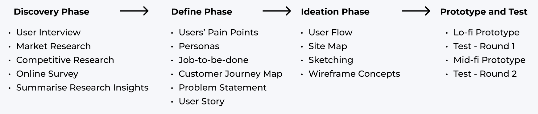
We began the discovery phase by conducting targeted user interviews with school teachers and Pacific students. This helped us understand the unique challenges faced by Pacific youth as a community. Additionally, we explored the current market landscape to identify gaps and barriers impacting Pacific teenagers and younger learners. Our research revealed the reasons behind the underrepresentation of Pacific culture in educational content, which informed our approach to designing a more inclusive and engaging learning platform.

We also conducted a competitive analysis of similar products to explore potential design directions. This allowed us to evaluate key features of existing streaming platforms and gain insights into what works well for users as well as common pain points to avoid.

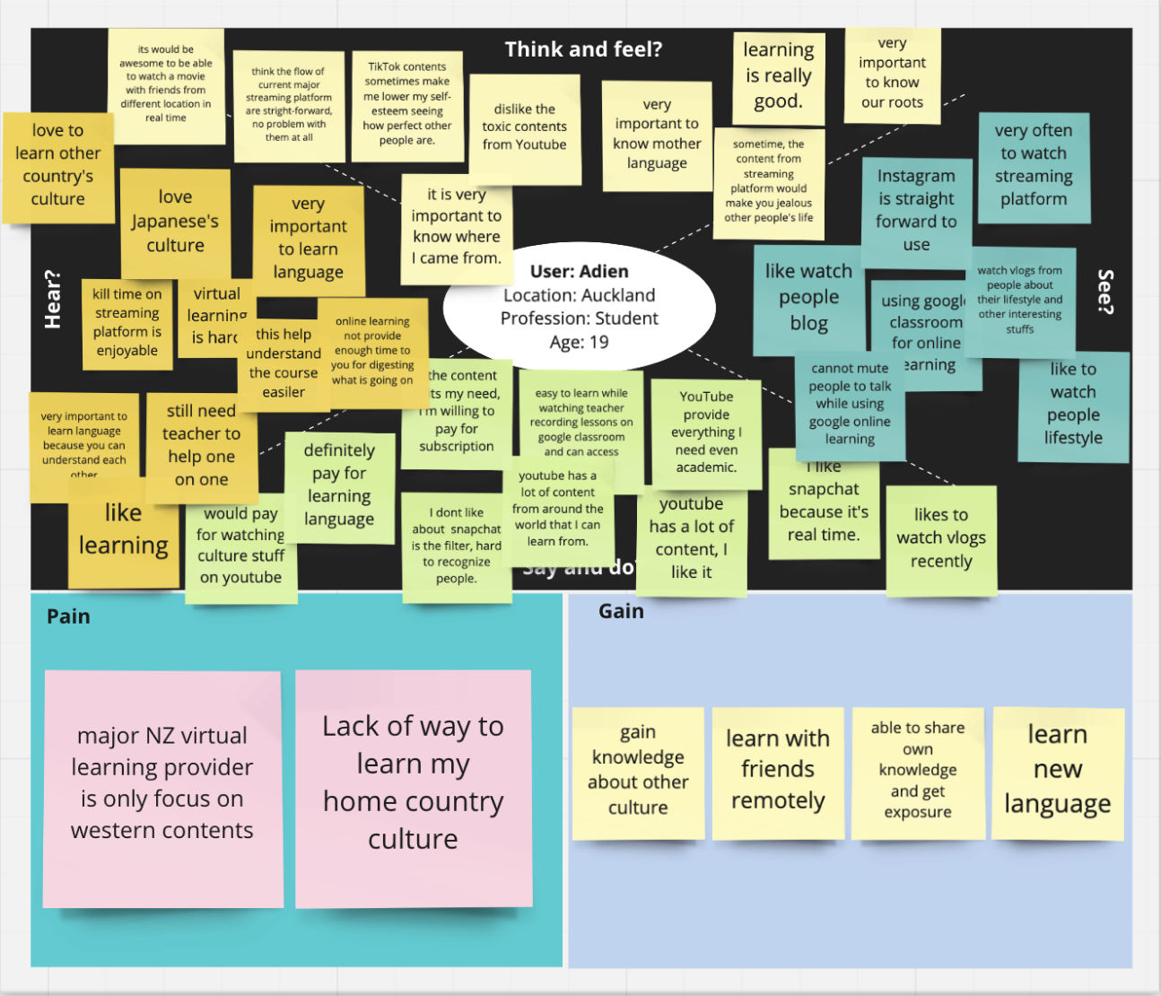
We summarised all the feedback into empathy maps, which helped us identify recurring pain points, user goals, and behavioral patterns.

We then consolidated all our research findings into key insights, identifying potential pain points and possible solutions. This foundation guided our design decisions moving forward.
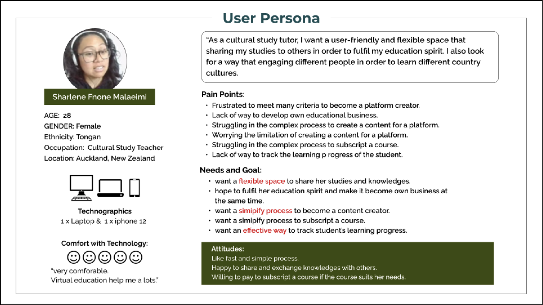
After gathering key insights about the audience and their pain points, I created user personas to represent the primary user segments. These personas helped me stay focused on addressing the most pressing problems and core needs of the most important user groups. Each persona is a blend of fictional and real-world elements, grounded in research but designed to clearly reflect common behaviours, goals, and challenges.
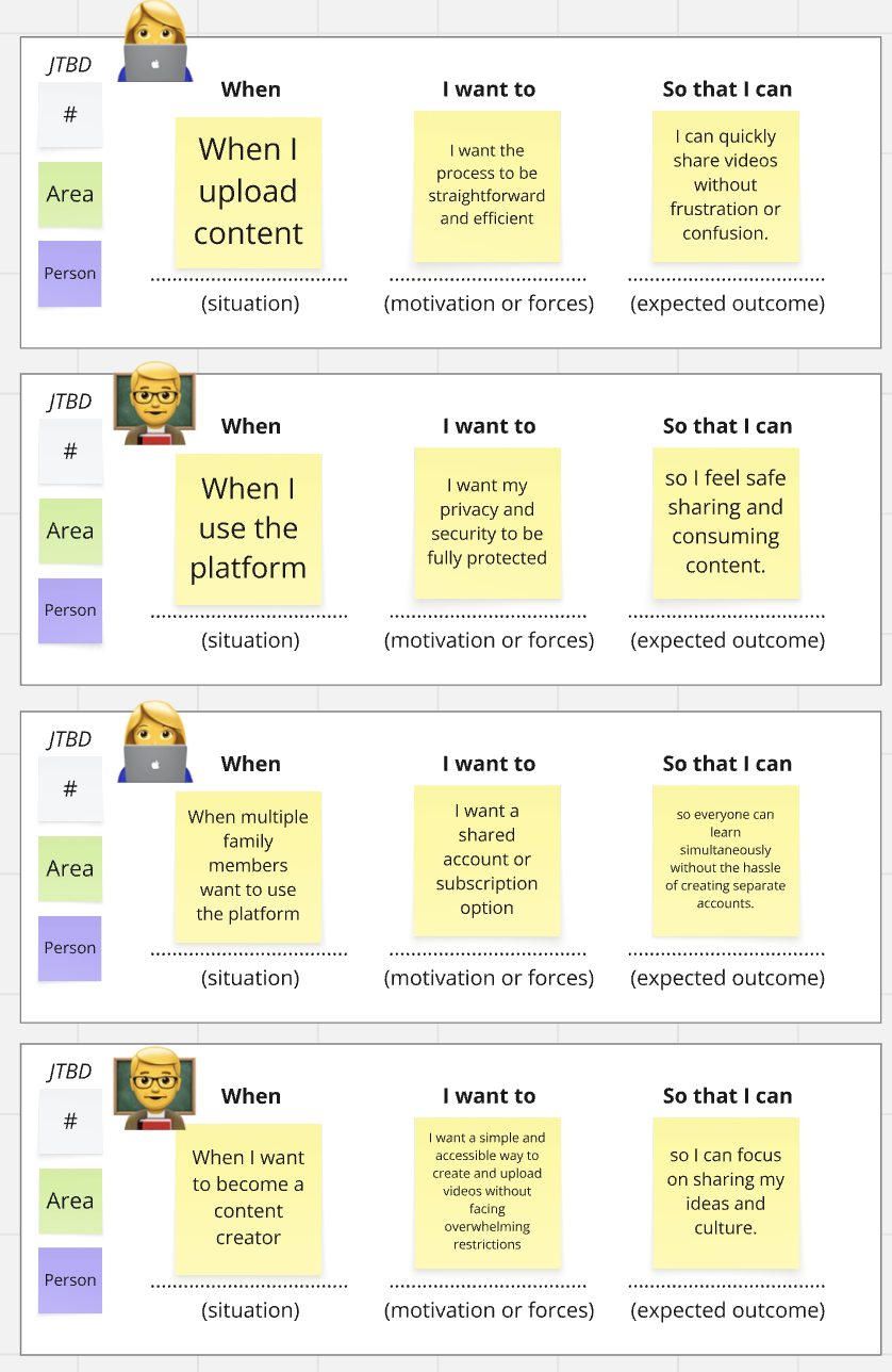
We leveraged our research data to identify core pain points and generate potential solutions. Using the Jobs-to-be-Done (JTBD) framework, we organized our findings to clearly articulate user needs with greater clarity and focus.

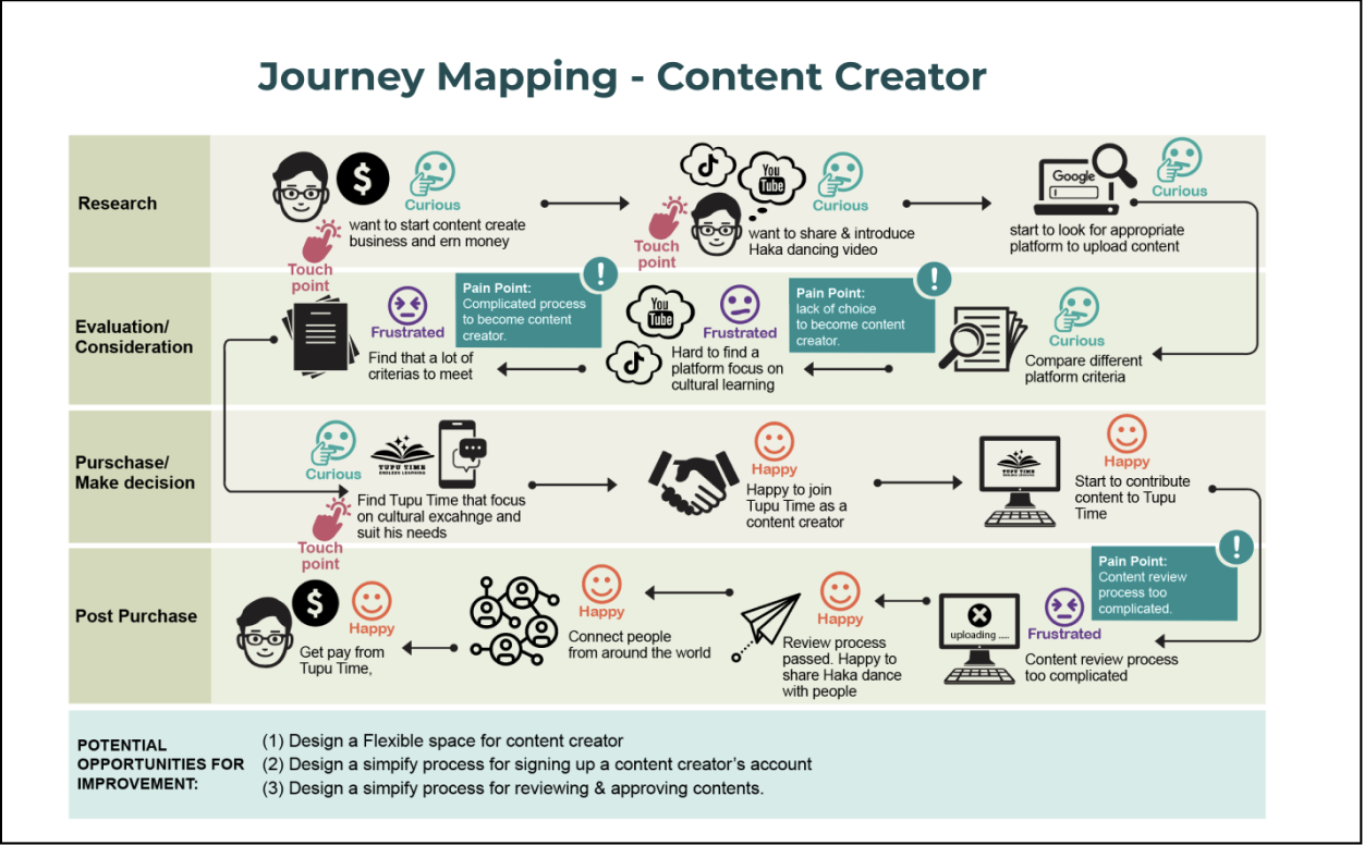
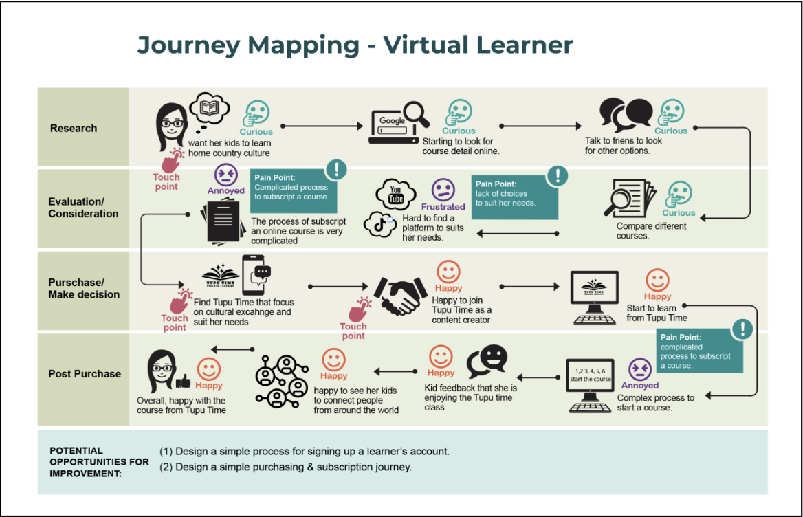
Customer journey maps are used to visualise the relationship between a customer and a business over time, across all touchpoints and channels. This process helps me better understand the target user’s behaviours, needs, and pain points, and allows me to clearly define the problem areas that the design solution should address.
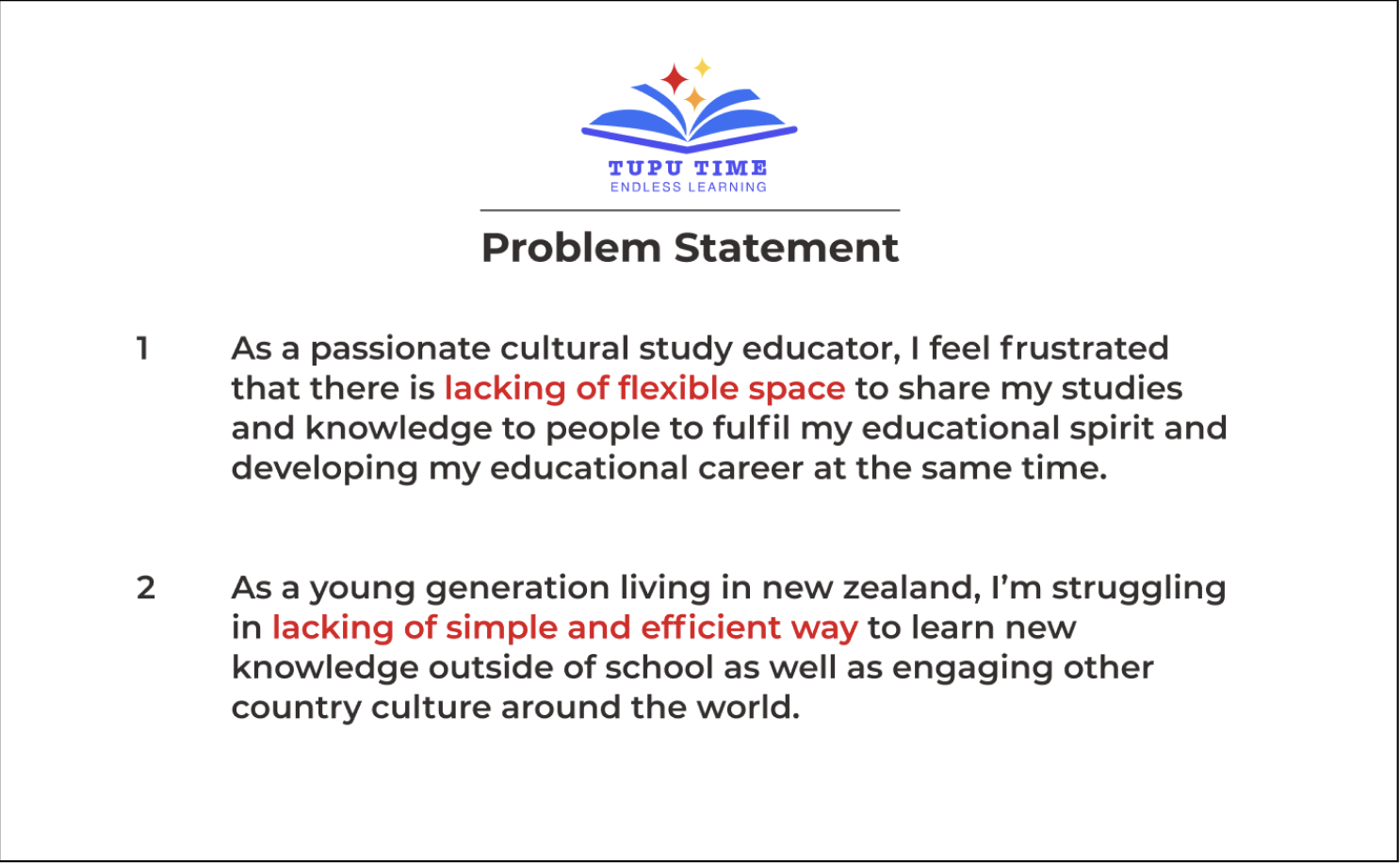
Finally, we consolidated all our findings to define a clear problem statement and user stories that aligned the team around the key user challenges and guided our design direction.
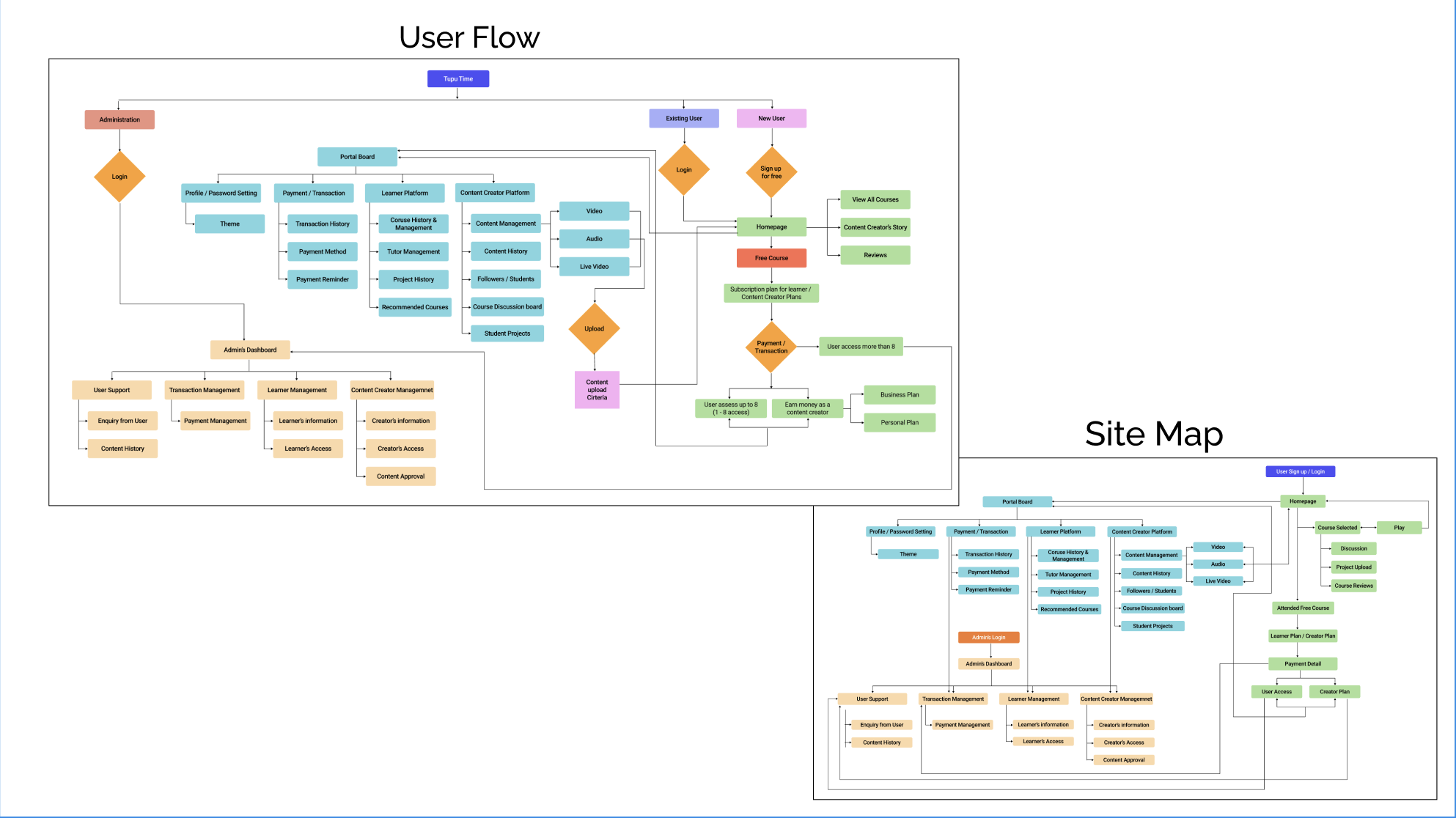
To define the scope of my design, I started by mapping out the main user flows for completing key tasks. This approach allowed me to focus on designing the most critical pages and interactions. Additionally, I created a comprehensive site map of the entire application, which helped visualise the platform’s overall structure and improve information architecture.
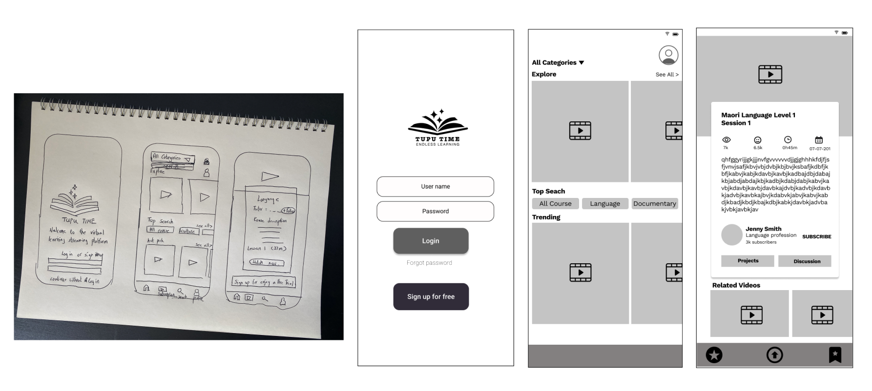
Once we established our design direction, I began sketching to brainstorm ideas and explore possibilities. These initial concepts were then refined into wireframes, adding greater detail and precision. Wireframing allowed me to focus on visual consistency and information hierarchy before applying styles. In the wireframes, I incorporated proven design patterns observed in competitor platforms, alongside elements that directly address users’ goals, needs, frustrations, and motivations.
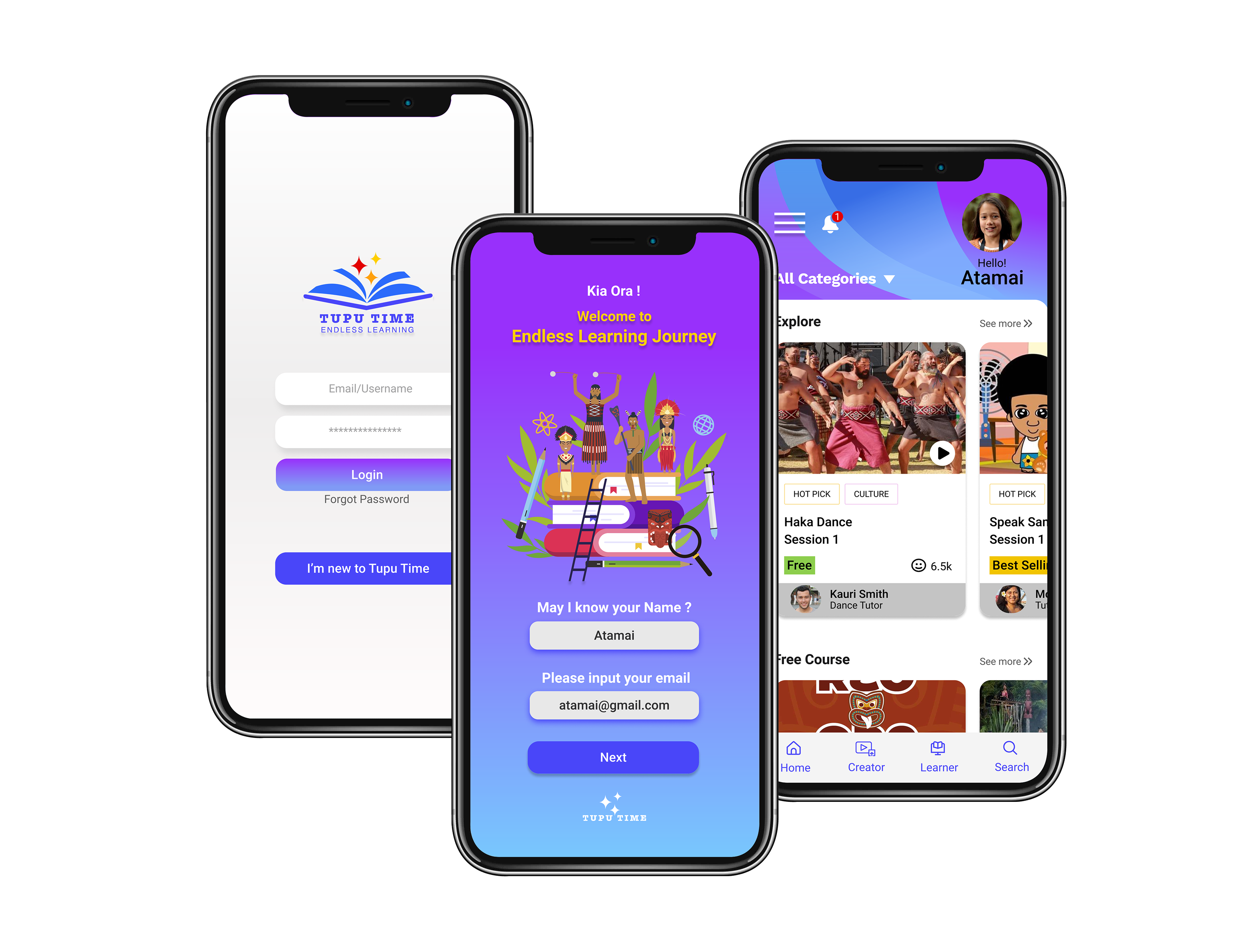
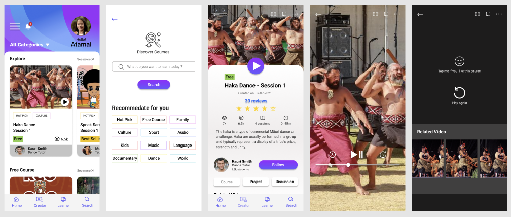
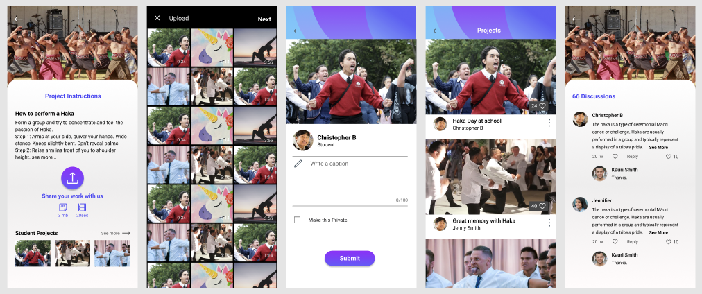
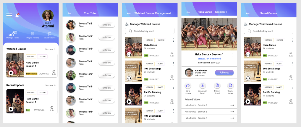
Once the wireframes were finalised, I transformed them into a responsive prototype to bring the concept to life and demonstrate its functionality. At the same time, I prepared usability tests to validate our design assumptions and gather feedback from real users.
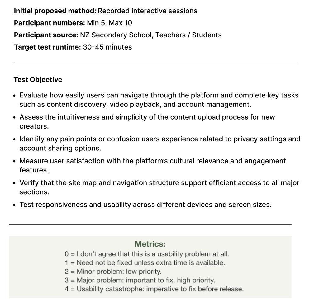
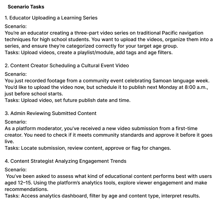
Before conducting a usability test, it's essential to define the scope, objectives, testing script, tasks, and evaluation criteria to ensure meaningful results. To prepare effectively, I created a checklist outlining what I wanted to test, why it was important, and how the results would be measured. This preparation helped ensure the testing process was focused, consistent, and aligned with our design goals.

After completing the usability test, we gathered and analyzed all feedback to extract key insights and identify areas for improvement. Based on the outcome, we iterated on the design to address usability issues and enhance the overall experience. If necessary, we conducted additional testing to further validate our solution. Once our assumptions were validated and the design was refined, I finalized the deliverables and prepared them for handover to the development team.
